Yak Ales: Family Brand Management
& Multi-SKU Rollout
The Brief
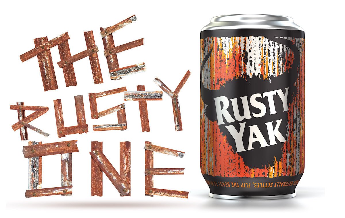
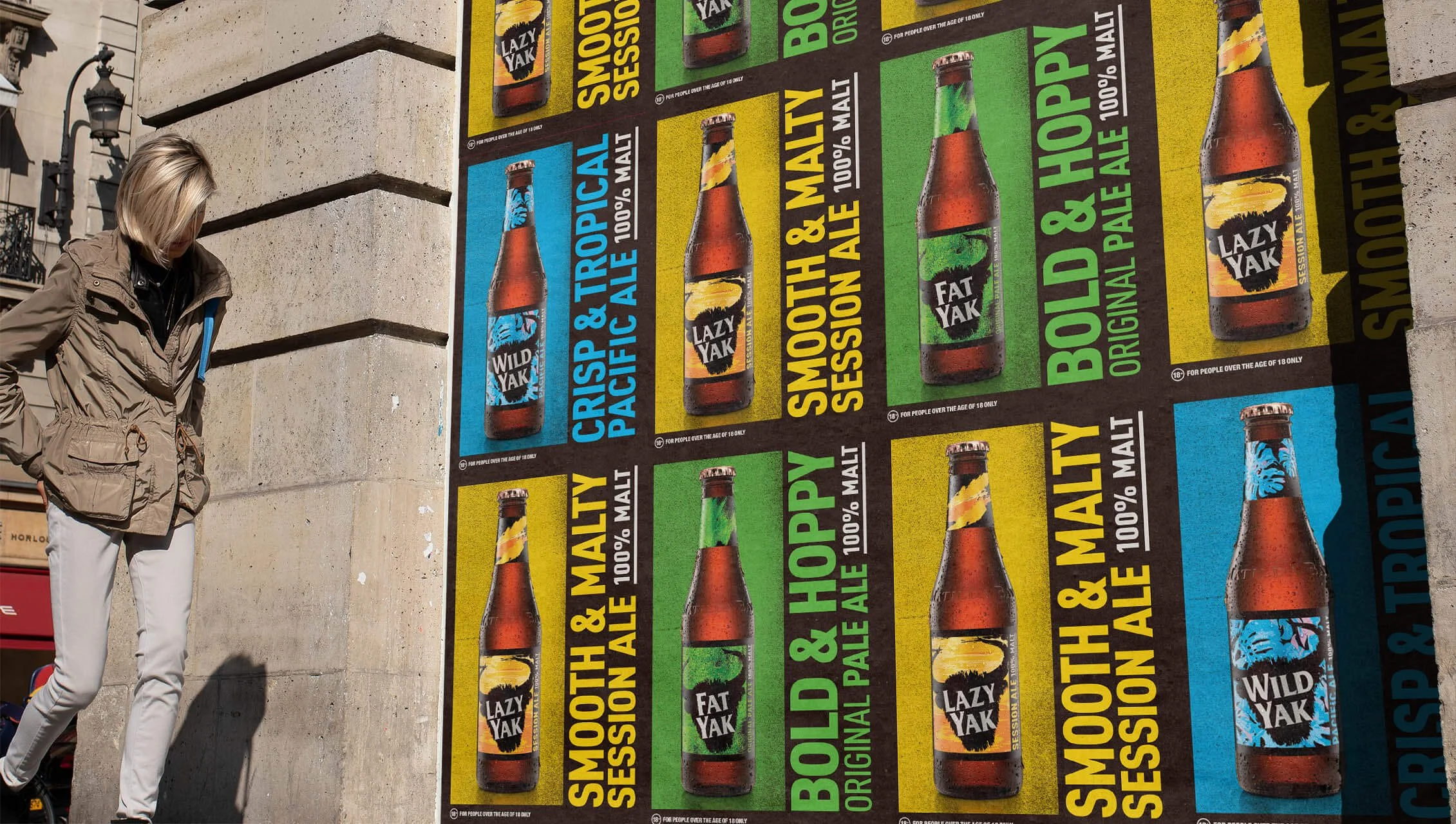
The Yak Ales portfolio featuring the iconic Fat Yak, Wild Yak, and Lazy Yak is a masterclass in craft beer branding that balances quirky personality with commercial scale. Working as a technical partner with the creative team at WhatCameNext_, I provided the finished art and production expertise required to maintain the visual integrity of the "Yak" family across a massive range of packaging and promotional assets for Carlton & United Breweries (CUB).
The Challenge
Each "Yak" variant has its own distinct color palette and character, yet they must appear as a unified family on-shelf. My role, supporting the vision of WhatCameNext_, was to ensure that the complex illustrative elements and vibrant spot colors remained consistent across different printing processes—from the metallic finish of a beer can to the matte texture of a cardboard 24-pack. Precision was paramount in managing the overlapping brand elements and ensuring all mandatory alcohol labeling was legally compliant.
Technical Focus & Deliverables:
Agency-Standard Rollout: Acted as a seamless technical extension of WhatCameNext_ to execute a high-volume, multi-SKU brand family.
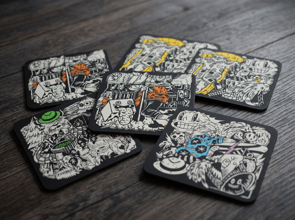
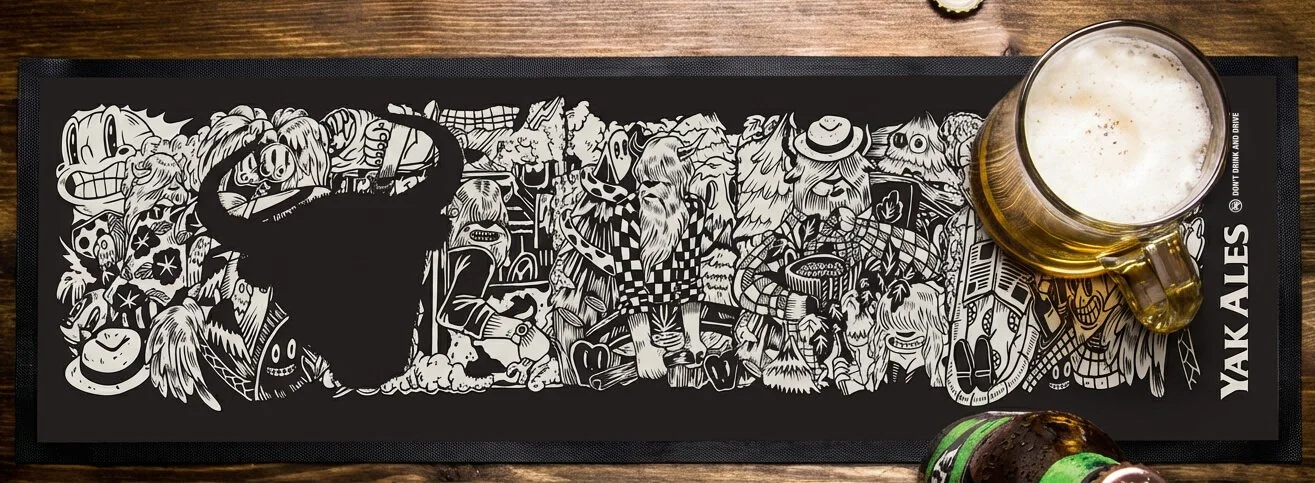
Complex Illustration Handling: Optimized the intricate, character-driven "Yak" illustrations for high-speed printing without losing detail.
Substrate Versatility: Tailored finished art for various formats, including bottle labels, cans, secondary clusters, and tap decals.