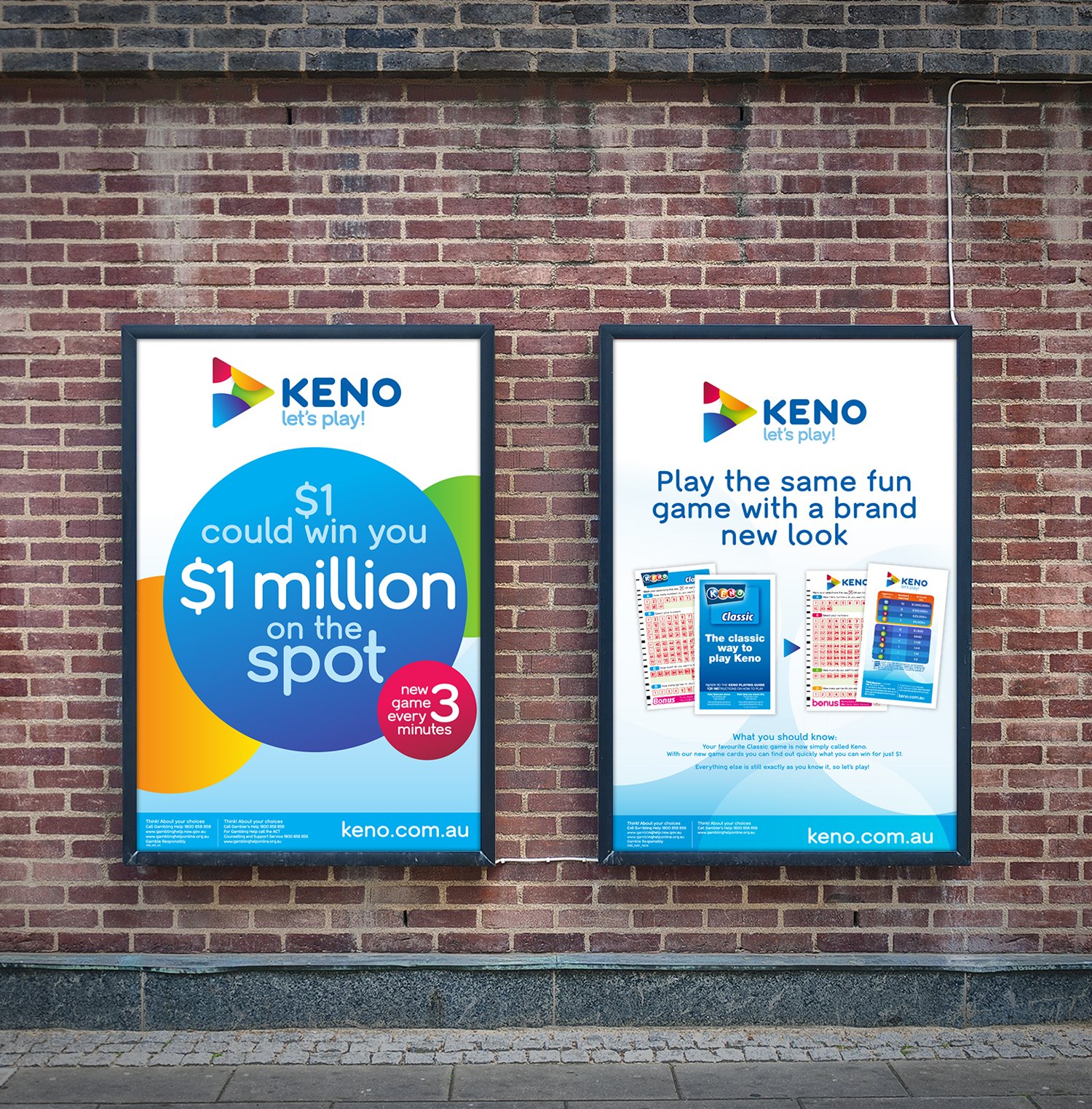
Keno Rebrand
The Brief
As a cornerstone of Australia’s gaming and entertainment landscape, the Keno brand requires more than just a creative spark, it demands rigorous technical precision. Working closely with the creative team at Tabcorp, I was responsible for the Finished Art and comprehensive asset rollout for the Keno brand refresh. My role was to bridge the gap between high-level creative concepts and the functional, high-stakes requirements of a national retail environment.
The Challenge
Transitioning a legacy brand across thousands of digital and physical touchpoints is a massive undertaking. From large-format outdoor signage to intricate in-venue point-of-sale (POS) materials, every asset had to be meticulously prepared for pre-press, ensuring perfect color reproduction (CMYK/Pantone) and adherence to strict Brand Guidelines.
My Core Deliverables:
Master Asset Creation: Developed the final, high-resolution production files for the new visual identity, ensuring scalability across all mediums.
Retail & POS Production: Managed the technical specs for diverse substrates, from digital UI elements to complex print-ready collateral.
Compliance & Regulatory Integration: Seamlessly integrated essential legal disclaimers and responsible gambling messaging without compromising the visual aesthetic.
Large-Format Precision: Executed pixel-perfect finished art for national signage campaigns, focusing on clarity and brand impact.
By focusing on the "heavy lifting" of the production phase, I ensured that the Keno redesign remained consistent, compliant, and visually striking at every point of customer contact.