Reschs Pilsner: Heritage Revival
& National Brand Rollout
The Brief
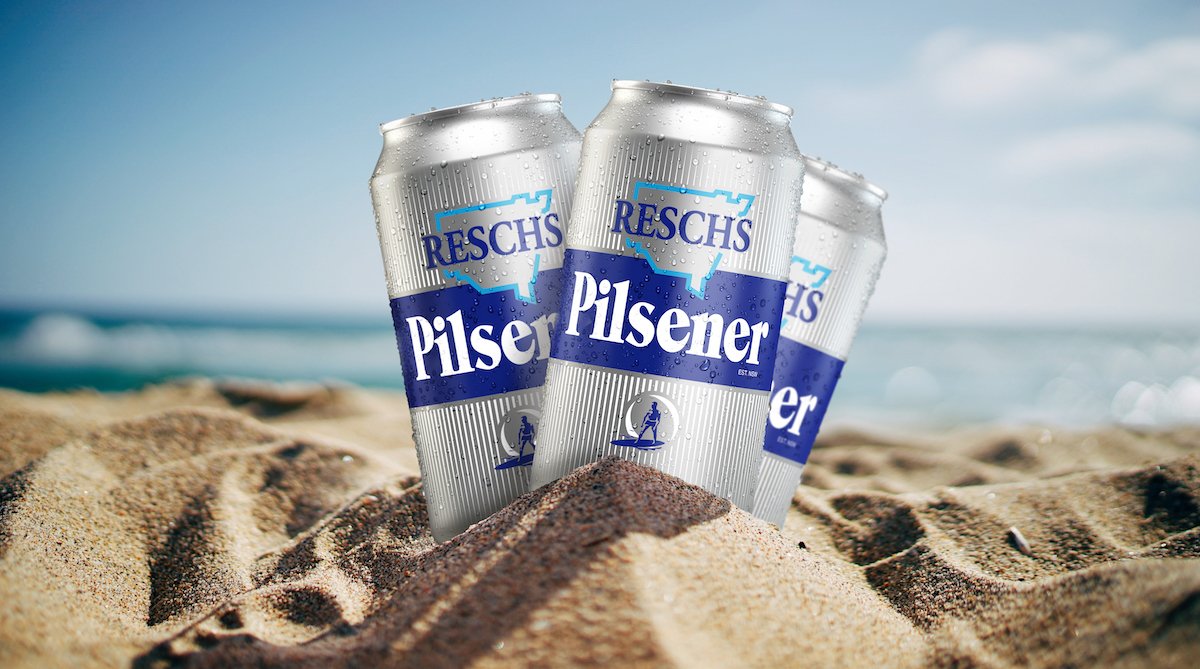
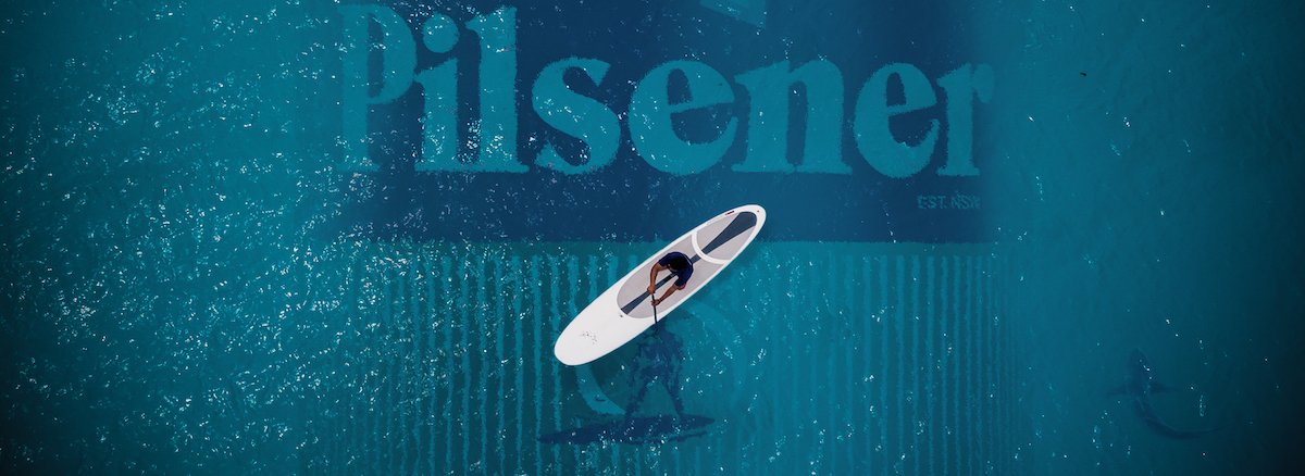
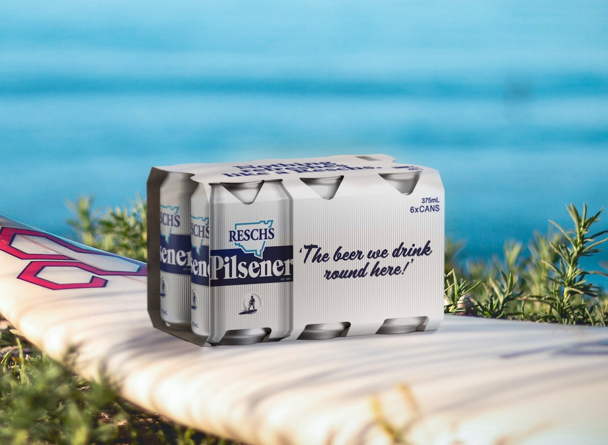
After a dedicated campaign by the Reschs Appreciation Society, Carlton & United Breweries (CUB) made the historic decision to bring back Reschs Pilsner after a 15-year absence. I partnered with WhatCameNext_ to execute the technical finished art for this revival. The design was a meticulous homage to the original brand, featuring a "surf icon" reference inspired by hand-painted heritage signage.
The Challenge
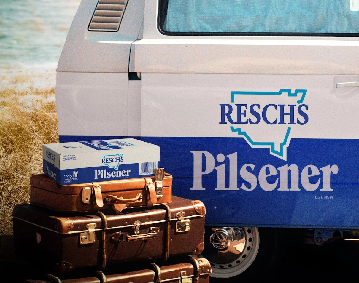
The challenge of a heritage revival is technical nostalgia—recreating the raw, authentic feel of vintage signage while meeting modern, high-speed production standards. I was responsible for the technical build across all brand touchpoints, ensuring the bold typography and "surf icon" remained consistent and impactful. This involved managing the artwork for everything from primary aluminum cans to secondary 24-pack cartons and large-format outdoor advertising.
Technical Focus & Deliverables:
Heritage Asset Execution: Building technical master files that honored the "hand-painted" aesthetic across modern packaging formats.
Multi-Format Packaging Rollout: Technical artwork for cans and secondary cardboard cartons, ensuring brand alignment and legal compliance.
Outdoor Advertising (OOH): Managing the file setup for national billboard campaigns to ensure typographic clarity and maximum visual impact.
Agency Integration: Acting as the technical production bridge for WhatCameNext_ to successfully re-launch this iconic NSW brand.