Batch X: Disruptive Wine Packaging & Technical Execution
The Brief
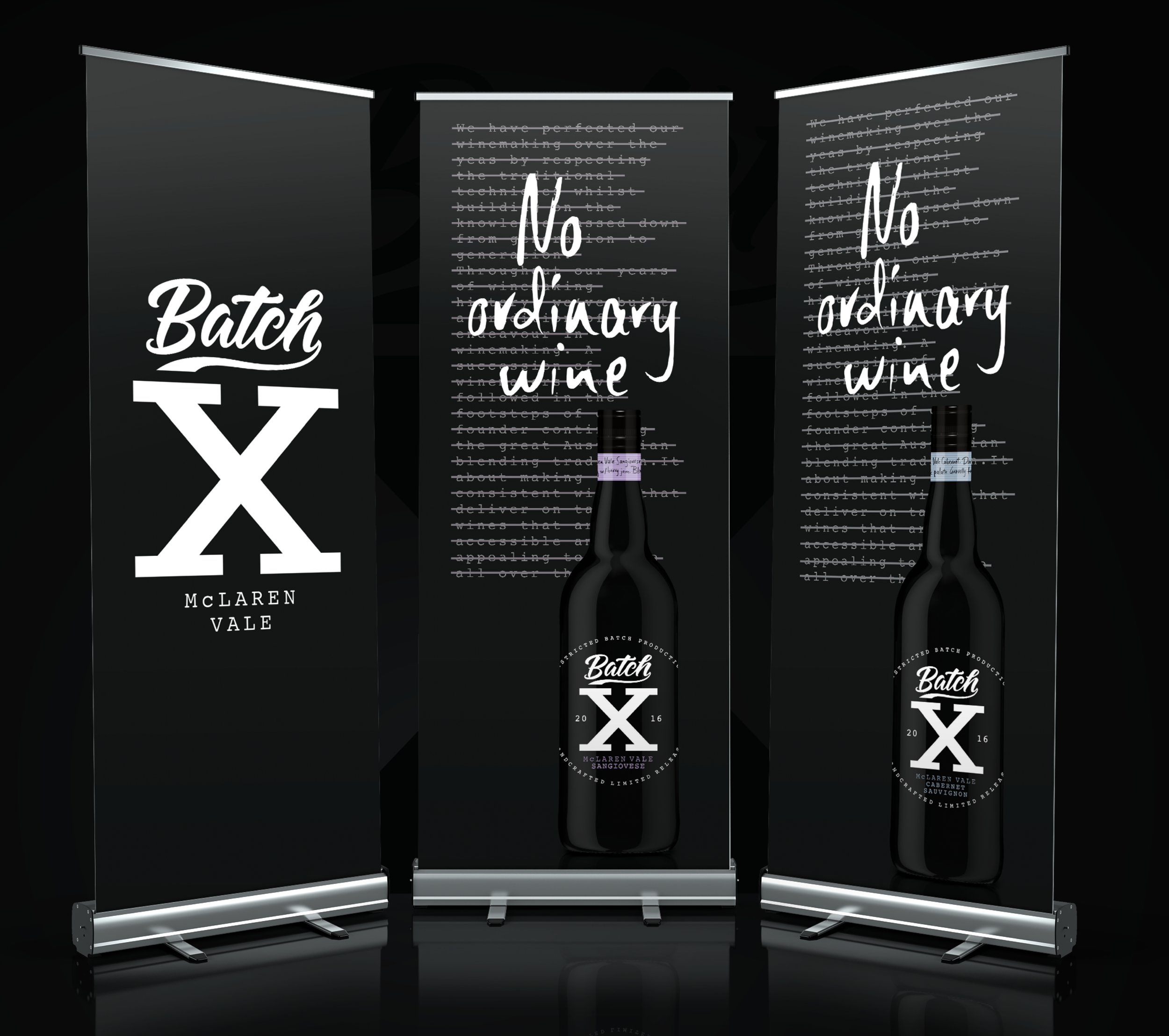
Batch X was created by WhatCameNext_ as a brand that challenges the traditional conventions of the wine industry. Designed to be bold and mysterious, the brand identity centers on a "top-secret" aesthetic. I provided the technical finished art for this project, taking the edgy, minimalist creative and preparing it for a high-quality physical rollout.
The Challenge
Minimalist wine labels are deceptively difficult to execute. When a design relies on high-contrast black-on-black or stark white space, the technical file build must be flawless. I was responsible for ensuring the "X" branding remained sharp and impactful across different bottle shapes and sizes, while meticulously managing the mandatory wine labelling requirements including alc/vol statements and standard drink icons without detracting from the "underground" brand feel.
Technical Focus & Deliverables:
Specialized Wine Label Art: Building high-precision files specifically for wine label application, focusing on typography and brand mark clarity.
Minimalist Brand Integrity: Ensuring the bold "Batch X" visual language remained consistent across various glass substrates and carton packaging.
Regulatory Precision: Expertly integrating all mandatory wine standards to ensure the product was 100% compliant for the Australian market.
Agency Partnership: Acting as the technical production arm for WhatCameNext_ to bring this disruptive wine brand to life.

Batch X wine packaging and disruptive brand identity - Technical finished art by Brian Hughes for WhatCameNext_.
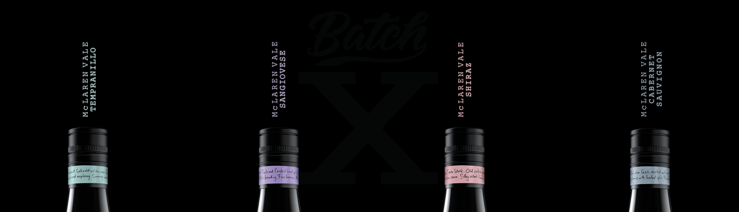
Batch X premium wine rollout showing consistent brand application across various bottle formats.
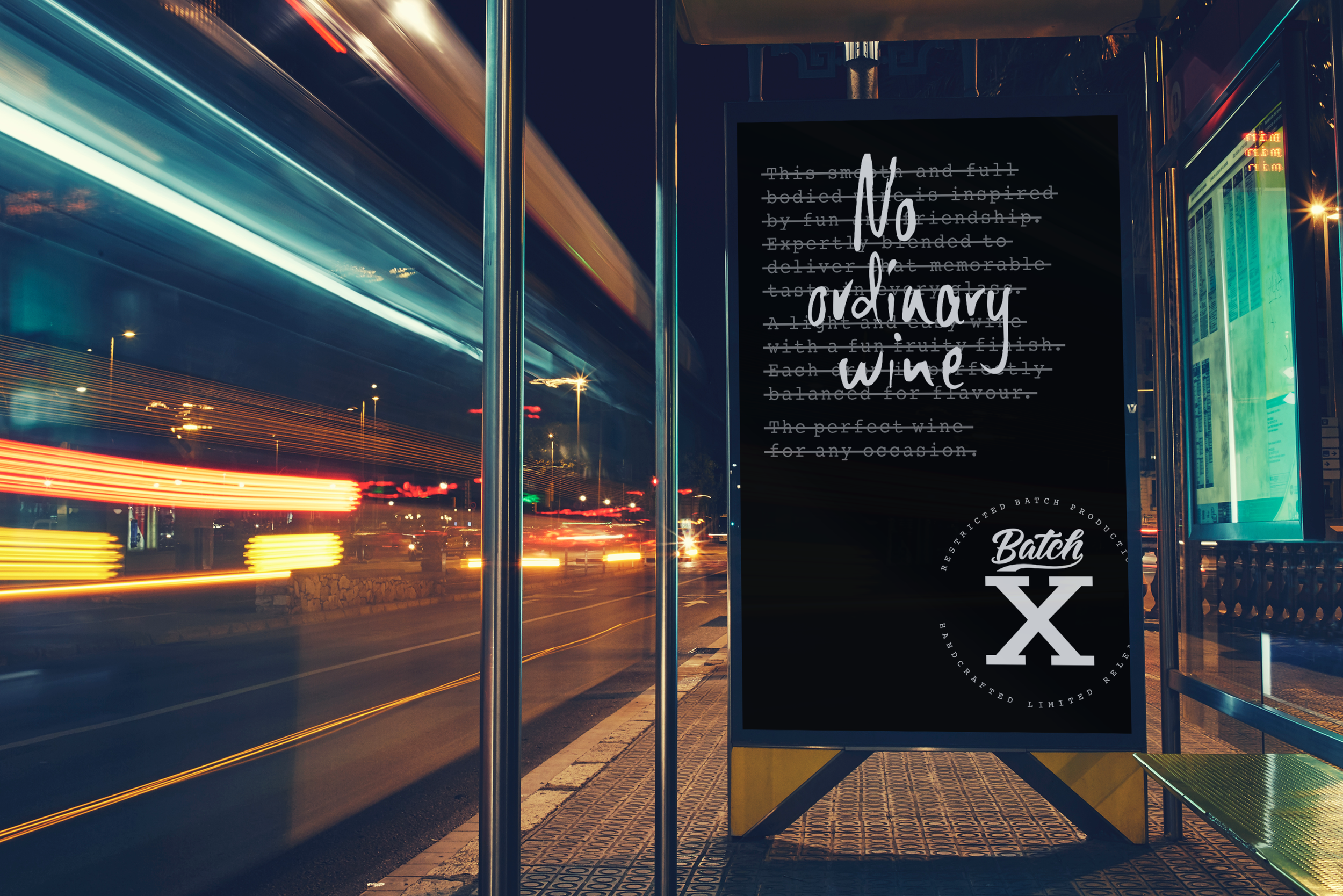
Brand X OOH