
Frothy Lager: Minimalist Identity & High-Impact Rollout
The Brief
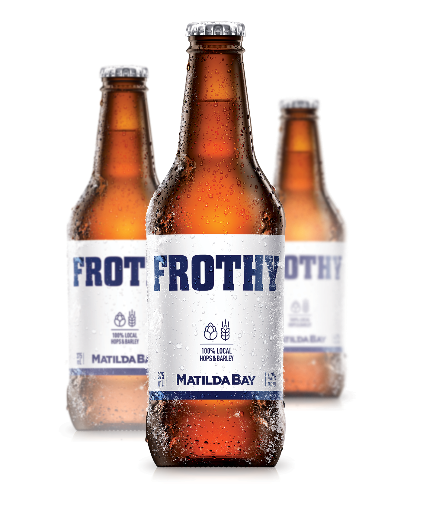
Frothy is a "no-nonsense" beer from Matilda Bay, designed to bridge the gap between craft and mainstream. I collaborated with WhatCameNext_ to handle the technical finished art for this "stripped-back" brand identity. The goal was to deliver a visual language that felt raw and real, confidently creating its own space in a crowded market through sheer simplicity.
The Challenge
When a brand is "naked" (free from overt tricks and finishes), the technical execution must be perfect. Without busy graphics to hide behind, every element from the placement of the bold typography to the consistency of the "naked" can aesthetic had to be meticulously managed. My role was to take the minimal creative direction from WhatCameNext_ and ensure it translated with power and clarity across all physical touchpoints.
Technical Focus & Deliverables:
Technical Master Brand Execution: Building clean, high-precision files for the signature "naked" can and box, ensuring the minimalist aesthetic remained iconic and intentional.
Large-Format & OOH Rollout: Managing the technical artwork for national billboard campaigns, focusing on typographic clarity and brand impact at scale.
Multi-Format Consistency: Ensuring the Frothy identity remained consistent across diverse substrates, from aluminum cans and cardboard cartons to digital assets and retail signage.
Production-Ready File Management: Delivering technically sound files that honored the "stripped-back" premium feel required for a national Matilda Bay launch.

Frothy Lager "naked" can packaging - Technical finished art by Brian Hughes for WhatCameNext_.
Frothy Matilda Bay brand identity rollout showing minimalist packaging and brand consistency.
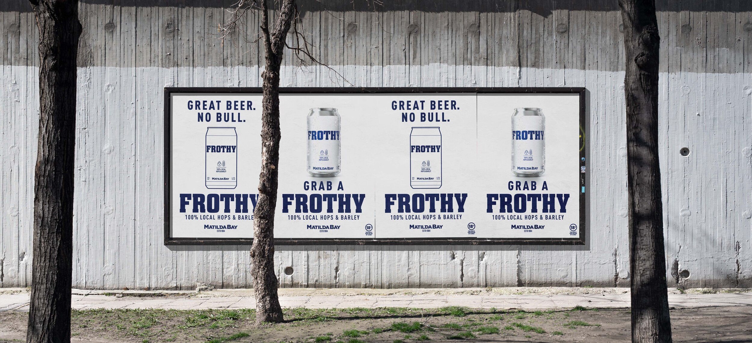
Frothy Lager national outdoor advertising (OOH) campaign rollout and finished art.
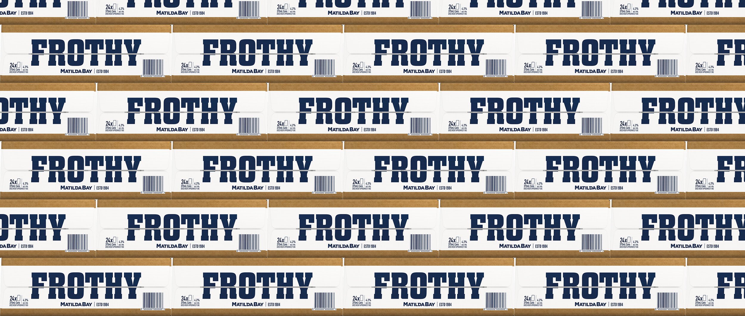
Frothy beer carton and secondary packaging technical artwork execution.